Spoilt for choice
Contents
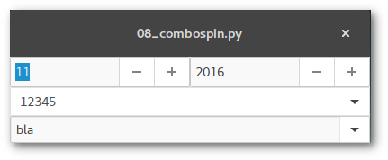
Spinbutton and Combobox
Named widgets simplify input of values by providing a value list or range. Value input is normally done via mouseclicks, key input is optional.
Glade
Spinbutton
In Glade some properties of spinbutton widgets can be set like the minimum/maximum/default value. It is required to tie a adjustment widget to the spinbutton. To do so select "General > Spin Button Attributes > Adjustment" and assign or create an adjustment.
Looking at the example file the two spinbuttons represent month and year dates. The month spinbutton is set to be circular, the minimum value follows after passing the maximum value. This act emits the wrapped signal which is assigned to then adjust the year date of the second spinbutton.
Combobox
There are two different combobox widgets in GTK+:
- GtkComboboxText
-
The list items of the dropdown menu are strings directly that are directly set in the Glade widget properties
- GtkCombobox
-
The list items are stored in a ListStore or TreeStore element that can hold data sets instead of a plain list. These data stores are accessible to different widgets (see the "List article").
Both widgets can include an optional entry widget which has to be activated in "General > Has Entry". By activating an internal GtkEntry widget is created. It is important to set "Common > Widget Flags > Can focus".
The first ComboboxText widget in the exampe does not possess an entry field, the user can only select an item from the list. In both widgets the changed signal is assigned to retrieve the selection.
Python
Spinbutton
The value of a spinbutton can be easily retrieved and set via get_value and set_value.
In the example the values for the month and year date are set with the current dates. The on_spin_m_wrapped function changes the year date up or down according to the value set in month date.
Combobox
Combobox lists can be extended by using the append function, p.e.
[self.builder.get_object("comboboxtext2").append(None,entry) for entry in ("foo","bar","yes","no")]
You get the selected item by calling widget.set_active_text() which also passes the text of the optional text entry widget.
Jumping off the greyscale
Pimp GUI using Cascading Style Sheets
CSS
GTK+ objects' layouts can be altered by using CSS. In my humble opinion the usage should not be exaggerated and the main part of the layout should be left to be managed by the theme. Links:
A GTK+ update - Changes since GTK+ 3.20
Glade
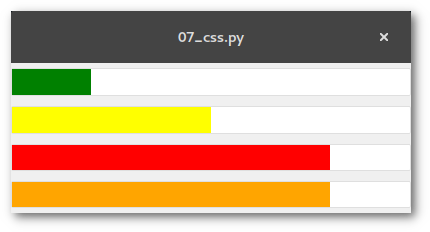
CSS layout instructions are set in the source code. This example shows the usage of CSS in levelbars so 4 of them are created with Glade.
Python
CSS
The pattern for layout instructions is
widget [element] {
  font...
  color...
  background...
  ...
}
that are stored in a string variable loaded by the Gtk.CssProvider() class.
Levelbar
Levelbar values can be displayed in different colours depending on the defined value range (see article "Bars"), p.e. to visualize a critical battery status. The predefined offset markers are:
low(<=.25)
high(<=.75)
full(bis 1)
The values can be retrieved by the get_offset_value function or created/changed with the add_offset_value function.
In the example the 4th levelbar has an additional offset marker between high and full that's why a value of 0.8 is not visualized as full like it is in the 3rd levelbar.
self.bar.add_offset_value("alert",.9)
Bars
Contents
Progressbars and levelbars
Glade
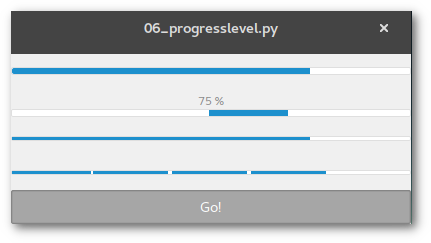
Progressbar
Progressbars usually show the current state of a longer lasting process. The widget offers two operation modes:
proportional mode, the progress is expressed by a value between 0 and 1
activity mode, a block moves back and forth
The widget posseses an optional text field. It shows the progress in percent if the field content is not specified otherwise.
Levelbar
Levelbar widgets are used as level indicators. The level is visualized like in a progressbar but it has some more properties:
-
Two operation modes:
continous: one single block represents the value
discrete: the levelbar is split into a defined number of blocks, each block represents a value range
Define minimum/maximum value, default is 0/1; the default number of blocks in discrete mode corresponds to the maximum value
Change colours when exceeding predefined values (see also CSS article)
Python
Progressbar
In the example the first progressbar operates in proportional mode, the second in activity mode. The latter does not show the progress in the text field, this has to be accomplished manually:
widget.pulse()
widget.set_text("%d %%" % perc_value)
Levelbar
What set_fraction is for progressbar is set_value for levelbar. This is self-explanatory for the continous mode. In discrete mode the number of blocks have to be factored in:
widget.set_value(fraction*blocks)
For the add_offset_value function and colour schemes read the CSS article.
Serve the menu
Menus, toolbars and statusbars
Glade
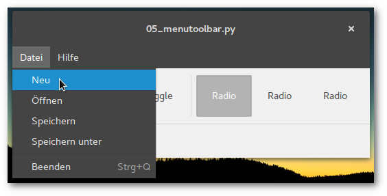
Toolbar
Toolbars contain different widgets like buttons, togglebuttons, radiobuttons oder (sub) menus. Generating and editing toolbars is analogue to menus.
Statusbar
The purpose of statusbars is to show notifications or useful information. Messages are treated like a list, the statusbar widget provides the functions push and pop.
Python
To send a message to the statusbar you will just need the function
widget.push(content_id,message)
If messages are exclusively shown "on top" the content_id can be a random number, like 0.
Clickbaiting
Switch, checkbox, radiobutton - more elements to click on
This article explains the usage of control and display widgets on the basis of these selected elements. The usage follows the pattern:
create container (box, toolbar etc.) for widget
add element
add an identifier to the element (that step canbe skipped for elements that do not need to be addressed in the source code like boxes or separators)
assign a function to a signal
(optional) test signal emission in Glade preview window
code funtion
All available GTK+ classes and their functions are documented in the Python GI API Reference >> Gtk 3.0 >> Classes.
Glade
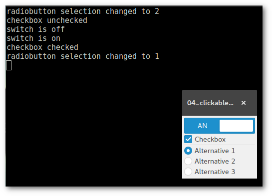
Switch
A switch is a widget that posseses two states, on and off. The current status can be retrieved by the state_set signal which is emitted on turning the switch on or off.
Checkbox
Checkboxes are basically just togglebuttons therefore the toggled signal is allocated.
Radiobutton
The purpose of radiobuttons is the selection of _one_ list item. The widget is also a sub class of GtkToggleButton (allocate toggled signal).
Every radio button is a member of a group. This is done via "General > Button Attributes > Group". There is one 'leading' radiobutton that are all other radiobuttons bound to.
Python
Given that checkboxes and radiobuttons are togglebuttons the status is retrieved by the widget.get_active() function.
When the state_set signal is emitted on the switch a parameter is passed containing the status as boolean (True/False).
def on_switch_state_set(self,widget,state):
    if state is True:
        print("switch is on")
    else:
        print("switch is off")
Open and close windows
Open and close windows and dialogues
Glade
There can be created different types of windows and dialogs (which are subclasses of windows). In this example the main window has two buttons. The first one opens an info dialog, the second one closes the main window and opens another window instead.
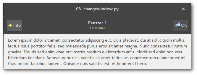
7 Signals are assigned:
- (per) window
"info" button (headerbar left): clicked
"ok" button (headerbar right): clicked
close/quit: destroy
- info dialog
close/quit: destroy
03_changewindow.glade (Source)
<?xml version="1.0" encoding="UTF-8"?>
<!-- Generated with glade 3.22.1 -->
<interface>
  <requires lib="gtk+" version="3.20"/>
  <object class="GtkWindow" id="win1">
    <property name="can_focus">False</property>
    <property name="resizable">False</property>
    <signal name="destroy" handler="on_window_destroy" swapped="no"/>
    <child type="titlebar">
      <object class="GtkHeaderBar">
        <property name="visible">True</property>
        <property name="can_focus">False</property>
        <property name="title">Fenster 1</property>
        <property name="subtitle">Untertitel</property>
        <property name="show_close_button">True</property>
        <child>
          <object class="GtkButton" id="info_button1">
            <property name="label">gtk-about</property>
            <property name="visible">True</property>
            <property name="can_focus">True</property>
            <property name="receives_default">True</property>
            <property name="use_stock">True</property>
            <property name="always_show_image">True</property>
            <signal name="clicked" handler="on_info_button_clicked" swapped="no"/>
          </object>
          <packing>
            <property name="position">1</property>
          </packing>
        </child>
        <child>
          <object class="GtkButton" id="button1">
            <property name="label">gtk-ok</property>
            <property name="visible">True</property>
            <property name="can_focus">True</property>
            <property name="receives_default">True</property>
            <property name="use_stock">True</property>
            <property name="always_show_image">True</property>
            <signal name="clicked" handler="on_button1_clicked" swapped="no"/>
          </object>
          <packing>
            <property name="pack_type">end</property>
            <property name="position">1</property>
          </packing>
        </child>
      </object>
    </child>
    <child>
      <object class="GtkBox">
        <property name="visible">True</property>
        <property name="can_focus">False</property>
        <property name="margin_bottom">9</property>
        <property name="orientation">vertical</property>
        <property name="spacing">10</property>
        <child>
          <object class="GtkLabel" id="label1">
            <property name="visible">True</property>
            <property name="can_focus">False</property>
            <property name="label" translatable="yes">Lorem ipsum dolor sit amet, consectetur adipiscing elit. Duis placerat, dui at sollicitudin mollis, lectus risus porttitor felis, sed malesuada purus eros sit amet magna. Nunc consectetur rutrum gravida. Mauris sed enim vitae orci mattis pretium eu interdum arcu. Morbi sed enim non erat bibendum tincidunt. Aenean nunc nisl, sagittis sit amet tellus ac, condimentum ullamcorper mi. Cras ornare faucibus laoreet. Quisque quis sagittis est, et hendrerit libero.</property>
            <property name="wrap">True</property>
            <property name="max_width_chars">80</property>
          </object>
          <packing>
            <property name="expand">False</property>
            <property name="fill">True</property>
            <property name="position">1</property>
          </packing>
        </child>
      </object>
    </child>
  </object>
  <object class="GtkAboutDialog" id="about_dialog">
    <property name="can_focus">False</property>
    <property name="title" translatable="yes">Info</property>
    <property name="resizable">False</property>
    <property name="modal">True</property>
    <property name="window_position">center-on-parent</property>
    <property name="destroy_with_parent">True</property>
    <property name="type_hint">dialog</property>
    <property name="deletable">False</property>
    <property name="transient_for">win1</property>
    <property name="program_name">Info Dialog</property>
    <property name="version">0.1</property>
    <property name="comments" translatable="yes">Platz für mehr Blabla</property>
    <property name="website">www.example.com</property>
    <property name="logo_icon_name">image-missing</property>
    <child>
      <placeholder/>
    </child>
    <child internal-child="vbox">
      <object class="GtkBox">
        <property name="can_focus">False</property>
        <property name="orientation">vertical</property>
        <property name="spacing">2</property>
        <child internal-child="action_area">
          <object class="GtkButtonBox">
            <property name="can_focus">False</property>
            <property name="layout_style">end</property>
            <child>
              <object class="GtkButton" id="close_button">
                <property name="label">gtk-close</property>
                <property name="visible">True</property>
                <property name="can_focus">True</property>
                <property name="receives_default">True</property>
                <property name="use_stock">True</property>
                <signal name="clicked" handler="on_close_button_clicked" swapped="no"/>
              </object>
              <packing>
                <property name="expand">True</property>
                <property name="fill">True</property>
                <property name="position">0</property>
              </packing>
            </child>
          </object>
          <packing>
            <property name="expand">False</property>
            <property name="fill">False</property>
            <property name="position">0</property>
          </packing>
        </child>
      </object>
    </child>
  </object>
  <object class="GtkWindow" id="win2">
    <property name="can_focus">False</property>
    <property name="resizable">False</property>
    <signal name="destroy" handler="on_window_destroy" swapped="no"/>
    <child type="titlebar">
      <object class="GtkHeaderBar">
        <property name="visible">True</property>
        <property name="can_focus">False</property>
        <property name="title">Fenster 2 </property>
        <property name="subtitle">Anderer Untertitel</property>
        <property name="show_close_button">True</property>
        <child>
          <object class="GtkButton" id="info_button2">
            <property name="label">gtk-about</property>
            <property name="visible">True</property>
            <property name="can_focus">True</property>
            <property name="receives_default">True</property>
            <property name="use_stock">True</property>
            <property name="always_show_image">True</property>
            <signal name="clicked" handler="on_info_button_clicked" swapped="no"/>
          </object>
          <packing>
            <property name="position">1</property>
          </packing>
        </child>
        <child>
          <object class="GtkButton" id="button2">
            <property name="label">gtk-ok</property>
            <property name="visible">True</property>
            <property name="can_focus">True</property>
            <property name="receives_default">True</property>
            <property name="use_stock">True</property>
            <property name="always_show_image">True</property>
            <signal name="clicked" handler="on_button2_clicked" swapped="no"/>
          </object>
          <packing>
            <property name="pack_type">end</property>
            <property name="position">1</property>
          </packing>
        </child>
      </object>
    </child>
    <child>
      <object class="GtkBox">
        <property name="visible">True</property>
        <property name="can_focus">False</property>
        <property name="margin_bottom">9</property>
        <property name="orientation">vertical</property>
        <property name="spacing">10</property>
        <child>
          <object class="GtkLabel" id="label2">
            <property name="visible">True</property>
            <property name="can_focus">False</property>
            <property name="label" translatable="yes">In sagittis purus nec eleifend dignissim. Curabitur venenatis eleifend leo ac tincidunt. Etiam ut consequat neque. Aenean in libero placerat, iaculis est quis, blandit nulla. Nulla euismod cursus nisl efficitur imperdiet. Sed vel augue vitae dui congue eleifend id eu libero. Cras laoreet velit nibh, et pharetra ante pharetra id. Nullam mollis arcu a nibh pulvinar, sed volutpat quam facilisis. Vivamus quis leo quis orci aliquam fermentum. Donec varius accumsan nisi eu ullamcorper. Integer condimentum, eros sit amet convallis vehicula, elit leo mattis risus, quis suscipit turpis nibh sed nulla. Sed id justo ut magna commodo eleifend. Praesent nunc arcu, elementum eu dolor nec, rutrum molestie mauris.</property>
            <property name="wrap">True</property>
            <property name="max_width_chars">80</property>
          </object>
          <packing>
            <property name="expand">False</property>
            <property name="fill">True</property>
            <property name="position">1</property>
          </packing>
        </child>
      </object>
    </child>
  </object>
</interface>
Python
The most important functions needed for handling windows are
# open window
Gtk.Builder.get_object("name").show_all()
# close window temporarily, can be retrieved by show_all()
Gtk.Builder.get_object("name").hide_on_delete()
# close window, quit Gtk
Gtk.main_quit()
Functions within the Handler() class of course can be assigned to multiple signals. So there are only 5 handler functions required in this example file.
The complete example code is:
#!/usr/bin/python
# -*- coding: utf-8 -*-

import gi
gi.require_version("Gtk", "3.0")
from gi.repository import Gtk


class Handler:

    def on_window_destroy(self, *args):
        Gtk.main_quit()

    def on_button1_clicked(self, widget):
        x.window.hide_on_delete()
        x.set_window("win2")

    def on_button2_clicked(self, widget):
        x.window.hide_on_delete()
        x.set_window("win1")

    def on_info_button_clicked(self, widget):
        x.about.show_all()

    def on_close_button_clicked(self, widget):
        x.about.hide_on_delete()


class Example:

    def __init__(self):

        self.builder = Gtk.Builder()
        self.builder.add_from_file("03_changewindow.glade")
        self.builder.connect_signals(Handler())

        self.about = self.builder.get_object("about_dialog")

        self.set_window("win1")

    def set_window(self, win):
        self.window = self.builder.get_object(win)
        self.window.show_all()

    def main(self):
        Gtk.main()


x = Example()
x.main()
See also the sequel article to dialogues.
Push the button
Buttons and labels
Glade
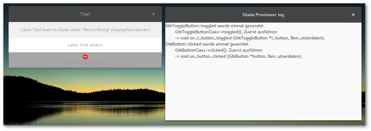
Based on the first example some elements are added, a label, a button and a togglebutton. Any control or display widget requires a container. In this example a vertically arranged container box is created. Boxes can be extended, downsized, rearranged and contain further container widgets.
Now the clicked and toggled signal are assigned to the button and togglebutton element. The label widget's purpose ist to display text so there is no signal assignment required.
Glade provides a preview function to test if the correct reaction is triggered.
Python
On a button click the label widget should change the diplayed text randomly chosen from a given list.
All Gtk.Builder elements can be addressed by the get_object function.
Gtk.Builder.get_object("name").function(options)

#Beispiel GtkLabel
Gtk.Builder.get_object("label_name").set_text("new text")
The task of the togglebutton is to clear the label widget display and deactivate the button which can be reactivated on the next click.
The status of togglebuttons can be retrieved by the get_active() function returning True or False.
Depending on the widget the corresponding signal function expects at least one parameter
def on_t_button_toggled(self,widget):
    if widget.get_active():
        #do something
    else:
        #do something different
View from the window
Minimal example
Glade
After launching Glade the application view is divided in 3 areas: window/widget selection on the left, the project view in the centre and a tree/property (including signal) view of project elements on the right.
Now a window is created and an ID assigned to be able to address the element in the source code.
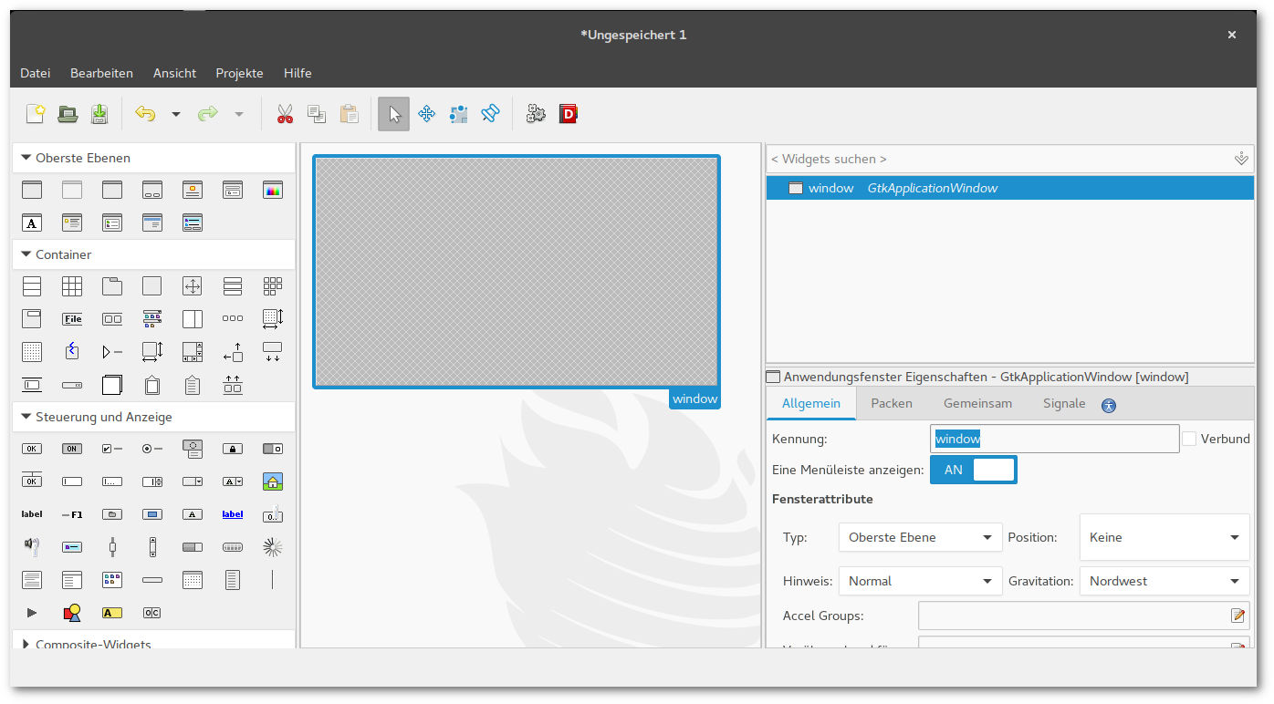
To call functions from widgets they have to be connected to signals. Depending on the kind of graphical object signals can be emitted by clicking, marking, editing, switching etc.
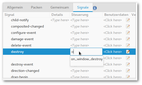
If the example window should be able to be closed on clicking the [X] button the signal destroy is required. The entry field to specify the function provides a convenient suggestion function to reduce key input following the pattern on_id_signal.
Glade does not generate GTK+ source code but a XML formatted file accessible to GtkBuilder (see listing below).
Python
First things first. GtkBuilder is provided by the Gtk module from the Python GObject Introspection bindings:
import gi
gi.require_version('Gtk','3.0')
from gi.repository import Gtk
After initing Gtk.Builder() the Glade file(s) are added.
builder.add_from_file(gladefile)
It may be convenient to work with multiple files in one project. In this case you have to bear in mind that if there are elements with the same identifier name only the element of the last loaded file can be addressed by get_object(id).
Second step is connecting the signals. It comes in handy to store these functions in an own class:
self.builder.connect_signals(Handler())
So this basic example script opens an empty window hat can be closed on clicking the close button.
Ohne Glade
This example corresponds to the basic example of the Python GTK+ 3 tutorial:
import gi
gi.require_version('Gtk', '3.0')
from gi.repository import Gtk

win = Gtk.Window()
win.connect("delete-event", Gtk.main_quit)
win.show_all()
Gtk.main()
The definded window does not contain any elements like boxes, buttons, bars, menus and other widgets.
Glade tutorial series
Motivation
Glade was my weapon of choice when I started creating the graphical interface for gpt and NoN. It itself is a GUI for creating GTK+ <http://www.gtk.org/> GUIs.
Glade project files are XML formatted GtkBuilder files. The connection to the source code is established by signals. Numerous languages are supported, I will use Python here.
There are plenty of tutorials and docs around that are not or only partly working or valid due to recent development progress (GTK+ and Python from 2.x to 3.x) but for the most part they are a good start (see links below).
I attempt to keep this basic tutorial up to date (Python 3.5.2 (3.6 just hit my machine and there aren't any problems so far but I will have a closer look on the examples) and Glade 3.20.0).
Non-exclusive
Of course GTK+ elements can be directly constructed in the source code. It is also possible to use both ways simultaneously or replace one with the other during development process.
The fact that Glade supports various programming languages it may also be possible to create applications in different programming languages using the same graphical interface.
Links
The Python GTK+ 3 Tutorial - Introduction to GTK+ with Python
PyGObject Tutorial - PyGObject documentation
Creating a GUI using PyGTK and Glade - Basic tutorial to PyGTK (Python 2.x)
Programmieren mit Python und Glade - extensive tutorial in German
Python GObject Introspection API Reference - complete reference of the GI module (bookmark this!)
Todo
WebKit2
Interaction between other applications
Es begann ganz harmlos
Intro
GoPros sind aufmerksamkeitsheischende Zeitfresser.
Man versucht sie an schöne Orte zu führen, man produziert dabei Unmengen an Daten, die man dann in mehr oder weniger aufopferungsvoller Arbeit im Videoeditor möglichst ansehnlich zurecht schneidet.
Wenn man ganz schlau sein möchte, schreibt man ein paar Skripte, die einem etwas Arbeit abnehmen.
Und dann schreibt man eine kleine textbasierte UI, um das etwas abzurunden.
Und dann erwischt man sich dabei, eine graphische Oberfläche zusammen zu zimmern.
Und dann schreibt man das in ein Blog...